I was inspired by this amazing site by Jill Hubley which uses publicly-available data of all the street trees in New York City, to see if the same data was available on the London DataStore. I couldn’t find the same thing for the whole city, although I did find just two of the 33 borough councils had published this data on the nation-wide data.gov.uk site (but not the London-specific DataStore for some reason).
However, while looking for the trees data, I did find a dataset of all the allotments in London. Pretty exciting stuff, I think you’ll agree, and something I’m sure something everyone wants to see mapped. And I thought it might be an interesting exercise in seeing how to handle slightly larger amounts of markers than I usually do, so…
Firstly, they provide the data in three different files. Two of them are zipped bundles containing a bunch of files in formats that aren’t familiar to me, but I assume are standard for GIS software used across the public sector. The third is just a plain-old CSV file, so that’s what I’ve gone for.
There are 741 allotment locations listed. I’ve imported that into a Google Spreadsheet, and got rid of the columns I didn’t think were necessary.
So initially I just want to grab all this data, and add it to a Google map as standard markers with infoWindows attached. Nothing new here. I exported my slightly amended version of the spreadsheet as a new .csv file, then used this site here to convert that into JSON structure. That did a pretty nice job of giving me an array with each allotment being an object like this:
{
    "Name": "Abbots Way",
    "Location": "Alongside railway line",
    "Borough": "Bromley",
    "Organisation": 0,
    "Facilities": 0,
    "Comments": 0,
    "Latitude": 51.393386,
    "Longitude": -0.047422
}
For the fields Organisation, Facilities and Comments this data seemed to be fairly inconsistent across the various councils, but mostly they were blank, which has ended up as zero in the JSON.
I then simply set this up as a JSON structure, and minified it using this site (reducing it from 206Kb to 103Kb). At this point it makes sense to get the data via AJAX, rather than embed this as a giant variable into my javascript code. I’m using jQuery’s $.ajax() method instead of their $.getJson() method, just because I’m running this locally, not using a webserver, and I needed to specify the mimetype using the beforeSend callback (thanks to this answer on StackOverflow).
$.ajax({
	dataType: "json",
	url: 'allotments-min.json',
	beforeSend: function(xhr){
		if (xhr.overrideMimeType) {
			xhr.overrideMimeType("application/json");
		}
	},
	success: function(data) {
		var allotments = data.allotments;

		for (var i = 0; i < allotments.length; i++) {
			createMarker(allotments[i]);
		}

		map.fitBounds(bounds);
	}
});
Then I simply add the markers, setup an event listener to update the infowindow with the relevant content, and extend the map’s bounds to fit them all in:
function createMarker(allotment) {
	var marker = new google.maps.Marker({
		position: {lat: allotment.Latitude, lng: allotment.Longitude},
		map: map,
		title: allotment.Name
	});

	bounds.extend(marker.getPosition());

	var content = '<strong>' + allotment.Name + '</strong><br>';
	if (allotment.Location) {
		content += 'Location: ' + allotment.Location + '<br>';
	}
	if (allotment.Borough) {
		content += 'Borough: ' + allotment.Borough + '<br>';
	}
	if (allotment.Organisation) {
		content += 'Organisation: ' + allotment.Organisation + '<br>';
	}
	if (allotment.Facilities) {
		content += 'Facilities: ' + allotment.Facilities + '<br>';
	}
	if (allotment.Comments) {
		content += 'Comments: ' + allotment.Comments + '<br>';
	}

	marker.addListener('click', function() {
		infowindow.setContent(content);
		infowindow.open(map, this);
	});
}
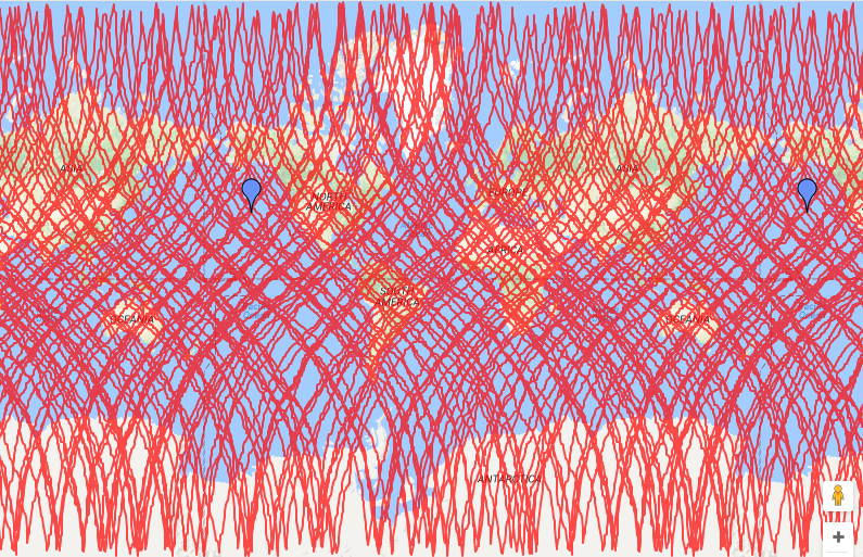
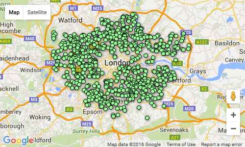
And this produces a map that looks like this:
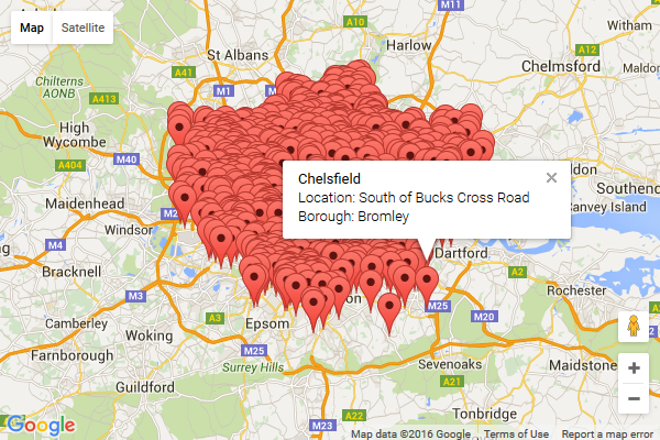
Well that works, and it’s simple, but there’s really too many markers tightly grouped together, and you can’t filter them down by Borough for instance. What can we do to improve this? The Google Maps API documentation lists several things you can do when working with large datasets. Let’s try a KML Layer. I need to convert my data to a KML format for starters. I used this handy site to do that for me, turning my 59Kb .csv file into a 466Kb .kml file. Each allotment now turned into an XML structure like this:
<Placemark>
	<name>Abbots Way</name>
	<ExtendedData>
		<SchemaData schemaUrl="#csv_20160528085652">
			<SimpleData name="Name">Abbots Way</SimpleData>
			<SimpleData name="Location">Alongside railway line</SimpleData>
			<SimpleData name="Borough">Bromley</SimpleData>
			<SimpleData name="Organisation"></SimpleData>
			<SimpleData name="Facilities"></SimpleData>
			<SimpleData name="Comments"></SimpleData>
			<SimpleData name="Latitude">51.393386</SimpleData>
			<SimpleData name="Longitude">-0.047422</SimpleData>
		</SchemaData>
	</ExtendedData>
	<Point>
		<coordinates>-0.047422,51.393386</coordinates>
	</Point>
</Placemark>
Great! So according to Google’s docs, it’s simply a case of adding a KmlLayer like so:
var kmlLayer = new google.maps.KmlLayer({
	url: 'http://www.example.com/allotments.kml',
	map: map
});
Firstly the KML file has to be publicly accessible, so I had it uploaded to my server (I’m only running the HTML file locally on my laptop). However it didn’t like that; I had to add KML (application/vnd.google-earth.kml+xml) to my list of mime types in IIS, otherwise I got a 404 error.
This still didn’t seem to work, and I stumbled across something which suggested any KML file over 10Kb should really be turned into a KMZ file instead. That was simply a case of zipping up the KML file, and changing the file extension to .kmz. Oh, and then adding KMZ (application/vnd.google-earth.kmz) as a mime type in IIS as well.
This still didn’t give me my full results; markers appear, but clicking each one just gave me the title, none of the other data. Turns out the lovely KML format I was working with contained lots of elements Google Maps API aren’t supporting (here’s the full list of what they do). So I had to reformat it, mainly replacing all the SimpleData elements with Data elements instead, and getting rid of a Schema declaration at the top, and ending up having each allotment in this format:
<Placemark>
	<name>Abbots Way</name>
	<ExtendedData>
		<Data name="Name"><value>Abbots Way</value></Data>
		<Data name="Location"><value>Alongside railway line</value></Data>
		<Data name="Borough"><value>Bromley</value></Data>
		<Data name="Latitude"><value>51.393386</value></Data>
		<Data name="Longitude"><value>-0.047422</value></Data>
	</ExtendedData>
	<Point><coordinates>-0.047422,51.393386</coordinates></Point>
</Placemark>
Finally that started working, giving me this kind of result…
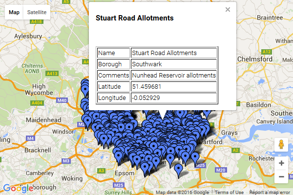
At this point there’s steps I could take to tidy up the layout of the infoWindow, but why bother? End result: a lot of faffing around for not much different from before. In retrospect, it seems KML is really a format more for the benefit of Google Earth than Google Maps, and I’m not sure I came up with anything useful just by changing my code to use that file format. Other than learning what’s needed to use KML files with the Google Maps API for future reference.
What about applying some marker clustering just to reduce the huge number of markers? That’s not too tricky, I just set everything up like in my original example, included the MarkerCluster JS file, and added this line in after I’d put all the markers into an array:
var markerCluster = new MarkerClusterer(map, markers, {imagePath: 'markerclusterer/images/m'});
The only gotcha I had was I needed to add the imagePath for the marker images to appear correctly (you may not need this, depending where your JS file is). And this then gave me:

Zooming in a bit you start to see different icons and individual markers, e.g.

Well a bit better for reducing the amount of markers displayed at any one time, and giving you an idea of how they’re grouped across the city, but still far from ideal. What I really want is to break it down by the various boroughs.
Next step, FusionTables. This article by Dan Nguyen was very useful: Intro to Data Mashing and Mapping with Google Fusion Tables. It took a bit of trial-and-error, importing data from Google Spreadsheets to Google FusionTables. I ended up with one file in Google Spreadsheets. It contained two spreadsheets:
One with all 741 allotments and their coordinates:

The other with all 33 boroughs and the coordinates for the polygons defining their boundaries:

This data came from this publicly-available KML file; I’m not sure how accurate or up-to-date that is, and it may not tally with the data to do with the allotments (e.g. boundary changes since that KML file was made may put some allotments in the wrong councils on the map). In this second sheet I added a new column, for a count of the allotments per borough. This used a simple formula, using COUNTIF to tally up how often the name of each council appears in the other sheet:
=COUNTIF(Allotments!C2:C742,A2)
You’ll notice in the above screenshot that in the row for Bromley the ‘geometry’ column is blank; this was also the case for several of the other councils. It seemed to be a problem importing from the KML file into Google Spreadsheets. I think I ended up turning this into a FusionTable, then manually editing the values for any missing polygons.
So at this point I imported both the spreadsheets into FusionTables as separate tables. In FusionTables you get an option to turn your table into a map. You can then choose Publish > Get HTML and JavaScript, and get all the code you’d need to turn that into a web page. Doing that with each of these tables, I got two separate maps;
One with all the council boundaries:
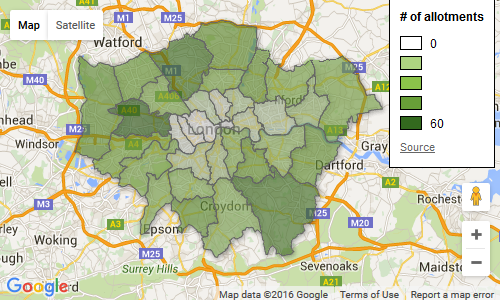
And the other with small markers for all the allotments:
In Fusion Tables it was easy to setup the colour schemes and add the ‘# of allotments‘ legend. All I need to do now is combine both of these into one map.
So initially I want to just display the council boundaries, so this FusionTablesLayer does that:
var boroughsLayer = new google.maps.FusionTablesLayer({
    map: map,
    suppressInfoWindows: true,
    query: {
        select: 'geometry',
        from: '15nhaHjAOYp2CrBJRJoP5bXkytmgfuRXYvGwsIuIk'
    },
    styles: [{
        where: 'count = 0',
        polygonOptions: {
            strokeColor: '#000000',
            strokeOpacity: 0.3,
            strokeWeight: 1,
            fillColor: '#edf8e9',
            fillOpacity: 0.1
        }
    },{
        where: 'count > 0',
        polygonOptions: {
            strokeColor: '#000000',
            strokeOpacity: 0.3,
            strokeWeight: 1,
            fillOpacity: 0.5,
            fillColor: '#bae4b3'
        }
    },{
        where: 'count > 15',
        polygonOptions: {
            strokeColor: '#000000',
            strokeOpacity: 0.3,
            strokeWeight: 1,
            fillOpacity: 0.5,
            fillColor: '#74c476'
        }
    },{
        where: 'count > 30',
        polygonOptions: {
            strokeColor: '#000000',
            strokeOpacity: 0.3,
            strokeWeight: 1,
            fillOpacity: 0.5,
            fillColor: '#31a354'
        }
    },{
        where: 'count > 45',
        polygonOptions: {
            strokeColor: '#000000',
            strokeOpacity: 0.3,
            strokeWeight: 1,
            fillOpacity: 0.5,
            fillColor: '#006d2c'
        }
    }]
});
The query gets all the polygon data. Then we want to give each polygon a different style based on the number of allotments. If you omit the ‘where’ part, you can set a default style; however you can only set up to 5 of these styles, and because I’m wanting five different colours based on the allotment count, I need to just specify all the styles for each possible option (and so I end up repeating all the properties apart from the fillColors).
This is the HTML for the map and legend:
<div id="map"></div>

<div id="legend">
    <p id="legend-title"># of allotments</p>
    <div>
        <span class="legend-swatch" style="background-color: #edf8e9"></span>
        <span class="legend-range">0</span>
    </div>
    <div>
        <span class="legend-swatch" style="background-color: #bae4b3"></span>
        <span class="legend-range">1 - 15</span>
    </div>
    <div>
        <span class="legend-swatch" style="background-color: #74c476"></span>
        <span class="legend-range">16 - 30</span>
    </div>
    <div>
        <span class="legend-swatch" style="background-color: #31a354"></span>
        <span class="legend-range">31 - 45</span>
    </div>
    <div>
        <span class="legend-swatch" style="background-color: #006d2c"></span>
        <span class="legend-range">46+</span>
    </div>
</div>
The values for the fillColor property obviously match up with the background colours on the legend. This adds the legend onto the map:
map.controls[google.maps.ControlPosition.RIGHT_TOP].push(document.getElementById('legend'));
Now what I want is if you click on any of the councils, it shows you just the allotments there. This does that:
allotmentsLayer = new google.maps.FusionTablesLayer();

boroughsLayer.addListener('click', function(FusionTablesMouseEvent) {
    allotmentsLayer.setMap(null);

    allotmentsLayer.setOptions({
        map: map,
        query: {
            select: 'col6',
            from: '1kBhYAiZGBsIzZ-iXQZ0VC8Lhr32IUf_WOp-cYntm',
            where: "'Borough' = '" + FusionTablesMouseEvent.row.name.value + "'"
        },
        options: {
            styleId: 2,
            templateId: 2
        }
    });
});
So firstly I’ve got a global variable for the allotmentsLayer. Each time I click a new council, I set its map property to null, removing any markers that were previously visible. The FusionTablesLayer‘s click event handler gives you a FusionTablesMouseEvent, which lets you know which row in the FusionTable that equates to. From this, I can get the name of the council, and I can then use that to query the FusionTable with all the allotments.
I’m also specifying an options property on the layer here. This isn’t documented in the Maps API, but when you get the generated HTML + Javascript from FusionTables, it includes those depending on how you style your markers. And they seemed to be required; I wasn’t able to style my markers otherwise from what I could see.
What I’m also doing is outputting the name of the council and the number of allotments it contains. And providing a ‘show all‘ link so you can see all the allotments at any time.
<div id="borough">
    <strong id="name"></strong> <span id="count"></span>
    <p><a href="" id="showAll">Show all allotments</a></p>
</div>
I wrap these up in a div and treat it like the legend, and add it directly onto the top-middle of the map:
map.controls[google.maps.ControlPosition.TOP_CENTER].push(document.getElementById('borough'));
And in the click event listener, I update the value of the HTML:
$('#name').text(FusionTablesMouseEvent.row.name.value + ': ');
$('#count').text(FusionTablesMouseEvent.row.count.value + ' allotments');
$('#showAll,#borough').show();
The ‘show all allotments‘ link has its own event listener, which just does the query again, but without a ‘where’ clause:
$(document).ready(function() {
    $('#showAll').on('click', showAllAllotments);
});

function showAllAllotments(event) {
    event.preventDefault();
    $('#showAll,#borough').hide();

    allotmentsLayer.setMap(null);

    allotmentsLayer.setOptions({
        map: map,
        query: {
            select: 'col6',
            from: '1kBhYAiZGBsIzZ-iXQZ0VC8Lhr32IUf_WOp-cYntm'
        },
        options: {
            styleId: 2,
            templateId: 2
        }
    });
}
And what all this gives is this:
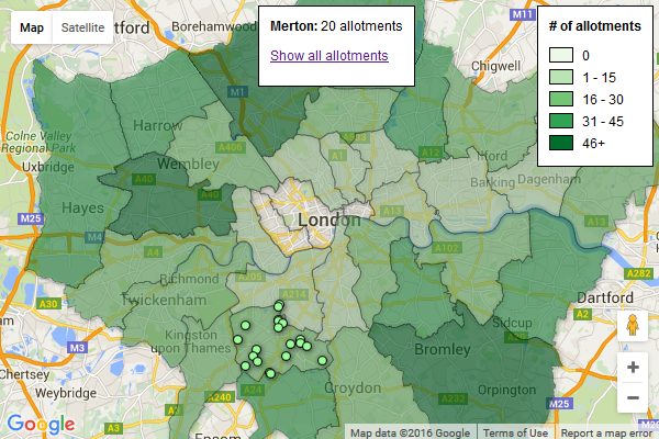
You can see it working here. This is more or less what I was hoping to end up with. I would have liked to fit the bounds of the map to fit each council as it was selected. And to have a list of all the councils, perhaps as a dropdown you could choose from. I’m sure these things must be possible.
From a data point of view, it would be good to include things like the length of the allotment waiting lists, or to have slightly more useful data about each allotment than just what the DataStore provided.
Next steps:
- use a different mapping system such as CartoDB or MapBox
- map what tree data is available for London
Some useful resources:
 //embedr.flickr.com/assets/client-code.js